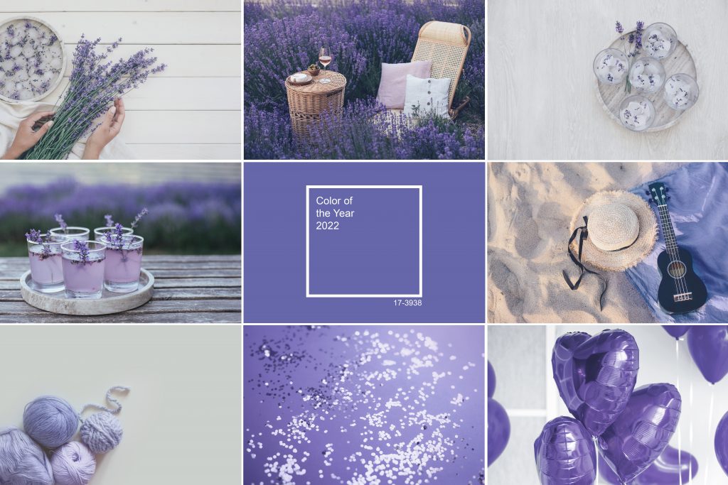
What better way is there to welcome the new year than with a splash of the trendiest hue? The Pantone Color Institute’s colour of the year for 2022 is Very Peri—a violet-infused blue that they actually created from scratch. The blue shade has a violet-red undertone and is meant to signify starting over and with happiness; it’s a fun, energetic, and spirited colour. Here’s how to use Pantone’s 2022 Colour of the Year in your decor.
Throw Pillows And Blankets
Wade into the periwinkle trend with a couple of small accents scattered throughout your main living spaces. Try introducing this bluish purple into your living room, family room, or bedroom via a well-placed throw pillow or blanket. It will add a bit of liveliness to the space and perk up any neutral-toned furniture you have. Feel free to play with the range of shades available too and go both a bit darker and lighter with your accents.
Pottery And Decorative Objects
You can take an even more subtle approach and introduce the Very Peri hue discreetly through the use of decorative objects or pieces of pottery. Strategically place a single vase or frame, dish or basket in any spot that could use a splash of colour; you could add the accent piece to your coffee table, shelf, mantel, or bookcase. Simply incorporate it into your existing colour scheme and accessories—it is surprisingly versatile and works well with many other shades. Those who are crafty may want to DIY their very own accessory.
Florals, Live Or Dried
One of the easiest ways to bring this exciting new shade into your home is through florals, whether they’re fresh or dried. A stem or two of a purple-hued bloom mixed in with a bouquet of neutral-coloured flowers and sprigs of fresh greenery is all it takes. Don’t worry about trying to find the exact shade of Very Peri at your local florist’s shop; in 2022 you’ll be seeing more lavender, lilac and cool pink accents overall so any shade within this range will look fresh and of the moment.
Accent Wall Or Nook
If you’re up for more of a transformation, why not paint an accent wall in your home in Very Peri? It’s a happy, energizing colour during the day and looks elegant and dramatic after dark. Find a spot that could use a bit of added interest and spend an afternoon applying a fresh coat of paint. For an unexpected hit of colour, you might want to try painting a wall at the end of a hallway, a nook, or a recessed wall; the year’s hottest hue can change the feeling of even the smallest, most unassuming space.
Bedroom Wall Colour
For those who may be feeling a little bit bolder, Very Peri makes a stunning bedroom wall colour. You’ll be surrounded by a deep, soothing hue that also happens to have a brightness and an optimism to it. It works well with neutrals and complements other equally saturated tones just as well so you can experiment with different looks and decide what you like best. The shade is sure to complement your existing furniture and linens; you can also try layering in a few of the accents mentioned earlier to tie the whole look together.
Rather than pulling an older colour out of their extensive archives, the team at Pantone decided that 2022 merited a brand new shade. Very Peri represents a fresh start and an optimistic outlook, and we couldn’t agree more. Thank you for reading and don’t forget to follow along with the Caliber blog for more home decor tips.